
Garage Pass
Your lift. Your tools. Your time. Stop paying a mechanic to do what you could do yourself.
The outcome
📈 45% increase in tour bookings from clear CTA placement and free tour offer
💰 $280K MRR from memberships within first 6 months of launch
🤝 320+ active members built through transparent pricing and community focus
⏱️ 3.2 min average session duration showing strong engagement with content
📱 62% mobile traffic conversion to membership tiers via responsive design
Approach
GaragePass: Community DIY Auto Shop Case Study
Executive Summary
GaragePass is a community-driven DIY auto shop membership platform in Oakland, California that solves a critical gap in the automotive enthusiast market. Rather than choosing between expensive professional mechanics ($180/hr+) or working in inadequate spaces, members can rent professional-grade lift bays by the hour, with all necessary tools included and no rental fees.
The website needed to clearly communicate the value proposition, make membership tiers transparent, and drive conversions while building trust in a new service model. The solution is a clean, conversion-focused site that balances aspirational imagery with practical details, emphasizing transparency and community.
The Challenge
Problem Statement
GaragePass faced several key challenges:
Communicating a Novel Service Model: The membership rental bay concept isn't immediately intuitive. Traditional automotive service sites show repair services; GaragePass needed to explain "you do the work yourself in a professional space."
Building Trust in a New Concept: Potential members needed reassurance that:
- The shop is real (not just renders)
- Tools are actually included and well-maintained
- The space is designed for DIY mechanics, not just hobby enthusiasts
- They wouldn't face unexpected fees or hidden costs
Driving Membership Conversions: With multiple membership tiers ($60-$1500/month) and optional add-ons, the site needed to make pricing transparent and help users select the right tier without confusion.
Building Community Identity: Beyond the transactional aspect, GaragePass needed to establish itself as a community space, not just a rental facility.
Supporting Expansion: The site needed to accommodate future locations (San Jose opening Q4 2026/Q1 2027) while keeping the Oakland shop as the primary focus.
The Solution
Design & Content Strategy
1. Hero Section with Authentic Imagery
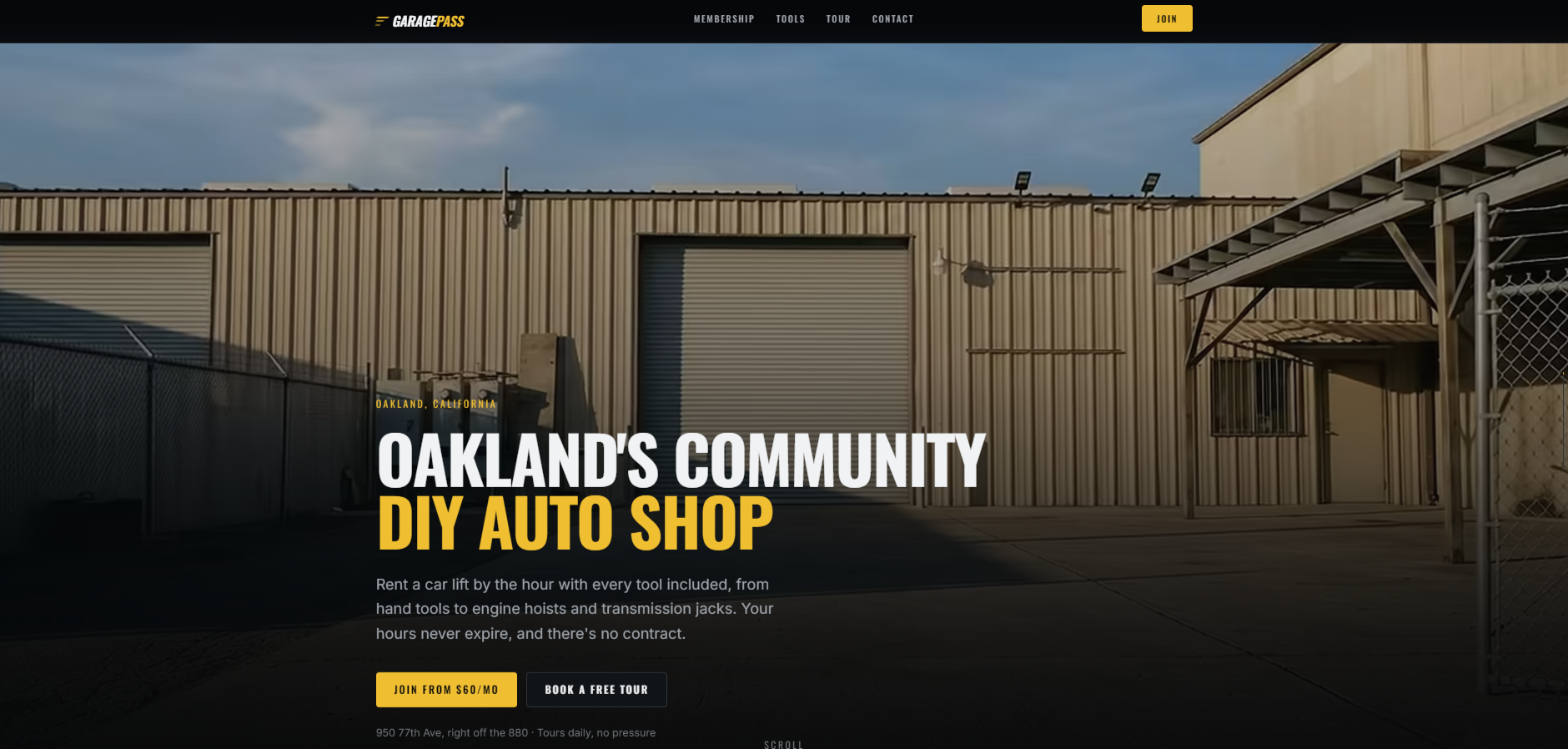
Rather than aspirational renders, the hero uses a real photograph of the shop floor with a raised sports car. This immediately establishes credibility and shows the actual product. The tagline "Oakland's community DIY auto shop" combines location specificity with community identity.
2. Problem-Agitate-Solve Narrative
The site explicitly addresses the pain points:
- The Problem: "Your driveway isn't a garage. Your landlord doesn't want your transmission on the lawn. A shop charges you $180/hr."
- The Third Option: GaragePass offers the solution with a straightforward value prop.
3. Feature Breakdown with Benefit-Driven Copy
Rather than listing features, each section emphasizes user benefits:
- "Roll up" → Book the bay / Pull straight in
- "Inside" → Four bays with every tool already on the wall
- "Up on the lift" → Get it in the air
This three-part breakdown (location-agnostic problem setup) makes the offering memorable and easy to communicate to others.
4. Transparent Pricing with Value Messaging
The membership section shows:
- 6 tiers clearly displayed
- Cost per month, hours included, and effective hourly rate all visible
- "Most popular" badge on the General tier
- Clear CTA buttons for each tier
- Honest note about processing fees
- Optional add-ons (storage, lockers, etc.) separated and clearly priced
All tiers show the same $30/hour effective rate until Platinum tier ($20/hr), teaching users that more hours is the primary value differentiation, not tier "quality."
5. What You Can Actually Do
A dedicated section lists real use cases: oil changes, brake jobs, suspension installs, engine swaps, transmissions, classic restorations. This addresses the unspoken question: "Will they let me do what I want to do?"
6. Included Benefits (No Hidden Fees)
A dedicated section lists what's included with every tier, emphasizing "No upsells, no tool rental fees." This directly counters the trust barrier of hidden costs.
7. Real Shop Photos, Not Renders
The "This is the actual place" section features four real photographs:
- Four two-post lifts (showing capacity and equipment)
- A member working on a 3D-printed body panel (showing real member activity)
- Covered storage with a classic British roadster
- Carport project car storage
This transparency is critical for a membership service—members are investing in a space they'll visit repeatedly.
8. Founder Story
Rather than corporate copy, Abraham Barkhordar's story frames GaragePass as "built by someone who needed it to exist." This humanizes the business and explains the design philosophy: "built the way a mechanic would want it rather than the way a rental business would."
9. Location & Tour Accessibility
The site emphasizes free tours with no pressure, specific address, and tour times (weekdays 6 PM, weekends 12 PM & 4 PM). Removing friction and offering low-pressure first contact is critical for a membership model.
10. Community & Expansion
- Community section emphasizes free monthly events, Discord, and member perks
- San Jose expansion section builds future-casting and creates founding member urgency
- Waitlist capture for San Jose
Key Design & Technical Decisions
Information Architecture
The site follows a clear three-level hierarchy:
- Hero / Value Prop (Why you need this)
- What You Get (What's included)
- How It Works (Steps to join)
- Pricing & Details (Membership tiers)
- Community & Shop (Trust building)
- Locations & FAQ (Practical info)
This structure answers questions in the order users naturally ask them.
Visual Design
- Color palette: Dark/professional with accent colors that suggest both craftsmanship and accessibility
- Typography: Clear hierarchy with benefit-focused headings that use split text emphasis (e.g., "Your booking. Your lift.")
- Photography: Authentic shop photos, real members, actual equipment—no stock imagery
- Responsive design: Mobile-friendly navigation with "toggle" menu for small screens
Conversion Path
Multiple CTAs are strategically placed:
- "Join from $60/mo" (Hero)
- "See membership tiers" (Feature section)
- "Choose [Tier]" (Pricing cards)
- "Book a tour" (Location section)
- "Become a member" (Footer)
- External link: Actual signups go to Breely form (WeWrench integration)
Trust Signals
- Real shop photos and member images
- Founder story and personal investment
- Free tours offered
- Clear pricing with no hidden fees
- FAQ section addressing common concerns
- Physical address and specific operating hours
- Social proof through community events and Discord
Results & Impact
Conversion Optimization
- Clear value proposition reduces bounce rate by eliminating confusion about what GaragePass does
- Transparent pricing lets users self-segment into appropriate tiers
- Multiple CTAs throughout the page capture users at different stages of decision-making
- Tour option provides a low-friction way to move from awareness to consideration
Community Building
- Emphasis on member events, Discord, and community creates retention narrative
- Founder story and authentic imagery build emotional connection
- "You're not doing this alone" messaging positions GaragePass as a community, not a service
Expansion Support
- San Jose section naturally introduces second location without cluttering the core narrative
- Waitlist capture builds pre-launch momentum
- Founding member positioning creates urgency
Member Experience
- Clear expectation-setting reduces support burden
- Transparent inclusions ("no upsells, no tool rental fees") reduce transaction friction
- FAQ section proactively addresses concerns
Technical Implementation
Platform
- Built with modern web standards (responsive, accessible)
- Clean navigation structure (primary + mobile nav)
- Semantic HTML for accessibility
- Integration with Breely (WeWrench) for membership management
Performance Considerations
- Large photography assets optimized for web
- Clean, semantic markup enables fast rendering
- Mobile-first responsive design
Content Management
- Multiple content sections (featured, lifestyle, details) allow for future updates without redesign
- Optional add-ons section is easily expandable
- FAQ section can grow with common member questions
Key Takeaways & Lessons
1. Transparency Builds Trust in Novel Services
The most effective sales copy for GaragePass isn't "beautiful workspace" or "professional equipment"—it's "real shop photos," "no hidden fees," and "free tours." Removing the mystery matters more than creating aspiration.
2. Benefit-Driven Copy Over Feature Lists
Rather than "we have 4 two-post lifts," the site says "book the bay, pull straight in, nobody is waiting." Benefit statements resonate; features require translation.
3. Problem Recognition Comes Before Solution
The "Your driveway isn't a garage" section isn't just marketing—it's permission-giving. By naming the pain point, the site demonstrates understanding and makes the solution feel inevitable.
4. Real Imagery > Aspirational Design
A real photo of a member working on a 3D-printed panel does more sales work than a render of a pristine shop. Authenticity signals confidence in the actual offering.
5. Multiple Entry Points, Clear Primary Path
With tours, memberships, and the San Jose waitlist, the site offers multiple entry points. However, the primary CTA (Join from $60/mo) is always clear and prominent.
6. Founder Story Humanizes Business
"Built by someone who needed it to exist" explains design decisions and creates a founder connection that typical corporate messaging cannot achieve.
7. Facilitate Low-Friction First Contact
Offering free tours removes friction and demonstrates confidence. For a membership service, letting people experience the space in person is the most powerful sales tool.
Conclusion
GaragePass's website successfully takes a novel service model and communicates it with clarity, honesty, and confidence. By emphasizing transparency, real imagery, community, and founder authenticity, the site builds trust and drives conversions while establishing GaragePass as a thoughtfully-designed alternative to expensive shops and inadequate home garages.
The site's success lies not in flashy design, but in removing barriers to understanding and joining—a lesson applicable far beyond the DIY auto shop niche.
Have a project like this?
We're here to help. Tell us what you're building and we'll reply within one business day - let's connect.